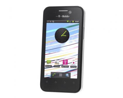
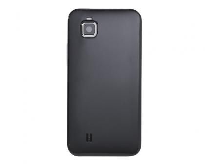
There's no denying that for its latest budget Android smartphone, T-Mobile has turned on the style. It's not hard to see where it got its inspiration from, with the squared-off body, glossy black rear and thing metal strip more than a little reminiscent of the Apple iPhone 4S .

While Apple's phone uses Gorilla Glass at the front and rear, with an aluminium frame in the middle, T-Mobile's handset is a more budget affair with a plastic case that gives the handset a hollow and cheaper feel to it. Give the price discrepancy between the two phones that's to be expected.
Under the case the Vivacity, which is manufactured by ZTE, has a modest specification, with an 800MHz single-core processor and Android 2.3 Gingerbread pre-installed. We're pleased to say that T-Mobile has left the standard Android interface alone, so it's easy to pick up and use.
It's also good to see that the phone isn't loaded with unnecessary applications, with just four T-Mobile apps added to the standard Android ones. They're standard fare for this kind of phone: My T-Mobile gives you help and advice about the network's services; My Services lets you see the free and paid-for services you can activate by calling T-Mobile's helpline; TopApps just lists recommend apps; and the Music Jukebox app is just a link to T-Mobile's online music shop.
Other pre-installed apps include Docs To Go, an office document viewer; Filer, a very basic file manager; Lookout Security, which scans for viruses and can also backup and locate your phone in case it's lost; and Notepad, a basic text editor.
Even though these apps don't take up a lot of room individually, by the time we'd installed updates from Google Play (the new name for the Android Market), there was only 94MB out of the 512MB of internal storage free. Fortunately, there's a microSDHC slot with a 2GB card included, so you've got a bit more space for those apps that support being moved to memory card.

While the 800MHz single-core processor might sound a little slow by today's standards, there are few apps running in the background, so the interface still feels snappy and responsive. Scrolling around complex web pages is a little jerkier than on high-end smartphones and complex websites can take a little while to render, but zooming in is still responsive and the phone's smooth enough to use every day.
It's good to see that the bright 3.5in screen has a respectable 480x800 resolution. Viewing angles aren't particularly good, but then as this is a handheld device it's no chore to hold it straight on. We found that colours were bright and punchy, but compared to an iPhone, the range of colours was slightly lacking, blurring out detail in some photos. That said, for day-to-day use you won't notice any problems.
Shots taken with the main 5-megapixel were good, although quite noisy when in low-light. This can be partially eliminated by using the bright LED flash to light up your subject matter. We're pleased to say that there's plenty of detail in each shot and no heavy-handed processing. Videos are shot at just 320x240, but aside from this poor resolution are otherwise clear and reasonably smooth.

The front-facing camera is a different story, however: shots resembled the work of an impressionist painter, and it's not recognised by Skype so you can't use it to make video calls. A battery life of just less than seven hours when playing movies is slightly below average, but you should still get a good day's use even using 3G, Wi-Fi, Bluetooth or GPS regularly.